
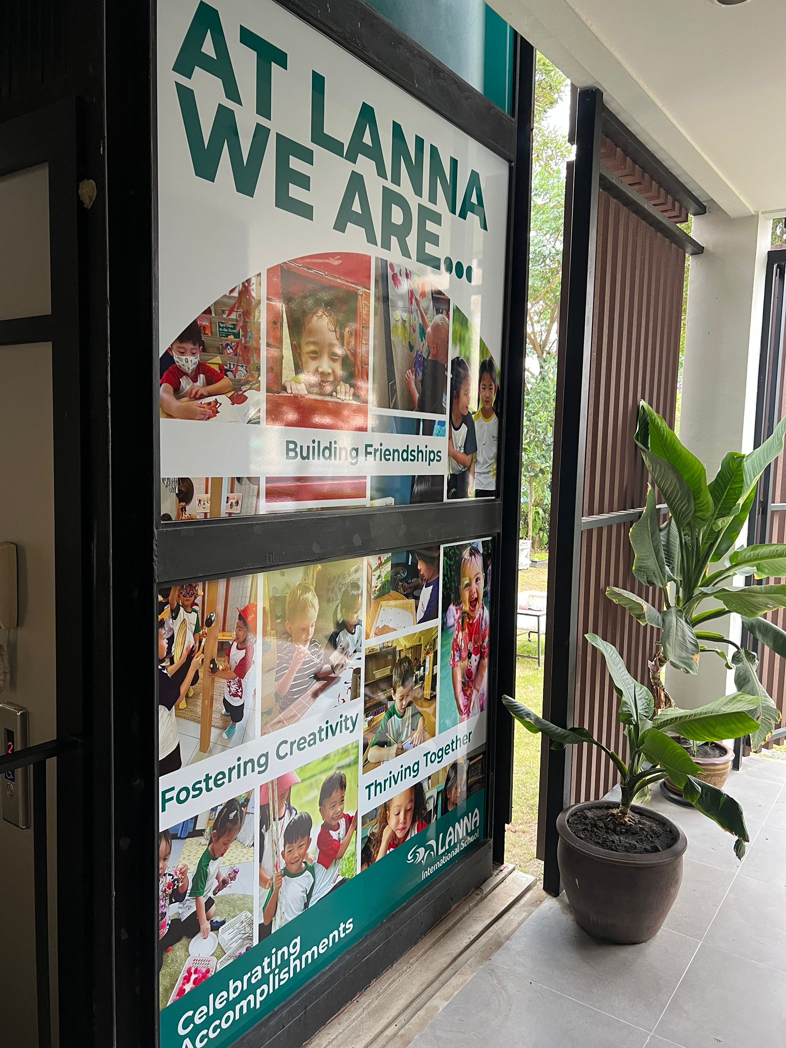
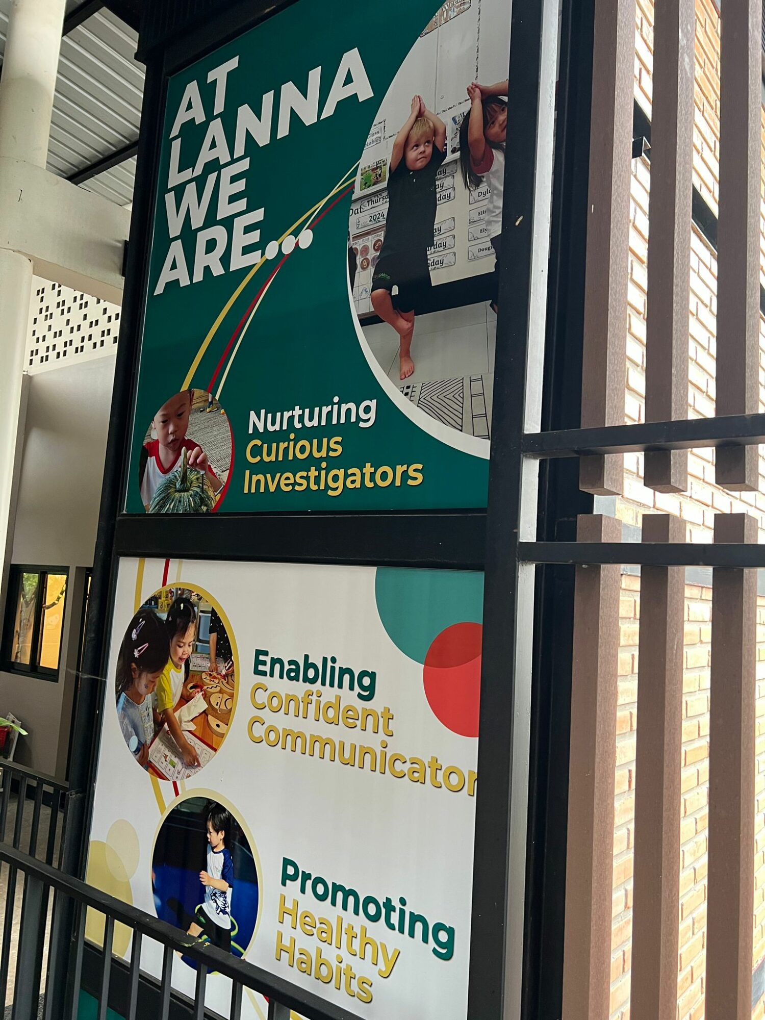
A decorative glass installation designed for a school elevator, shaped by architectural constraints and the way people move past and interact with the space.
Early diagrams were used to map panel placement and visibility, helping determine where visual emphasis would be most effective—and where restraint was necessary.
Project Overview
This project involved designing decorative graphics for a series of glass panels in an elevator, created for an Early Years environment within an international school. The aim was to develop a visually engaging installation that felt welcoming and age‑appropriate, while working within the practical realities of a public, high‑traffic space.
Because the work existed within an architectural structure rather than a neutral canvas, the design needed to respond directly to its physical context.
Defining the Challenge
The main challenge was panel placement and visibility. Each glass panel varied in size and position, and not all panels were equally visible to people passing by. Some were frequently seen and clearly exposed, while others were partially obscured or only visible briefly.
This meant the design could not rely on a single focal point or a uniform layout. Instead, each panel needed to function on its own while contributing to a cohesive overall composition.
Research & Exploration
The early phase focused on understanding how the elevator was experienced in real space. I considered sightlines, movement, and viewing distance—how both children and adults might encounter the panels while walking past, waiting, or using the elevator.
Rather than designing one large image and dividing it afterward, I explored approaches that treated each panel as part of a flexible system. This allowed the design to adapt to varying dimensions while maintaining visual consistency.
Concept Development
As the concept developed, I began assigning different levels of visual emphasis based on how prominently each glass panel would be seen. Panels positioned at eye level or along main circulation paths carried stronger visual elements, as they were most likely to be noticed by people passing through the space. In contrast, panels with limited visibility were treated more subtly, supporting the overall composition without competing for attention.
One panel was positioned between two floors, making it largely unreadable from any clear viewing angle. Rather than forcing a graphic solution where it would not function effectively, I made the deliberate decision to leave this panel as a plain color. This choice helped maintain visual continuity while preventing unnecessary visual noise in an area where detail could not be meaningfully perceived.
By varying scale, emphasis, and complexity across the panels, the installation acknowledges the architectural realities of the elevator while maintaining a cohesive visual language throughout.
Design Execution
With the structure established, I refined the graphics to ensure cohesion across all panels. Attention was given to proportion, spacing, and how the designs interacted with transparency and light through the glass.
Throughout execution, decisions were guided by how the work would be perceived in motion and within the space, not just how it appeared in isolation.
Outcome & Reflection
Final Outcome
- Delivered a site‑specific glass installation that responds directly to the elevator’s architectural constraints
- Created a cohesive visual system across panels of varying size, placement, and visibility
- Maintained an approachable and age‑appropriate presence suitable for an Early Years environment
Key Takeaways
- Designing for context: Spatial conditions such as sightlines, movement, and visibility played a central role in shaping the final outcome, reinforcing the importance of designing for an environment rather than independently of it.
- Intentional restraint: Choosing to leave one panel as a plain color—due to its position between floors—demonstrated that clarity and functionality can be strengthened by knowing when not to add visual elements.
- Flexibility within systems: Treating each panel as part of a flexible visual system allowed the design to adapt to uneven formats while remaining cohesive as a whole.
Looking Forward
The lessons from this project continue to inform my approach to future work, particularly in projects that involve architectural integration, spatial design, or non‑standard formats. It reinforced the value of using real‑world constraints as creative inputs and making deliberate, context‑driven decisions at every stage of the process.